We know things about your supply chain that you don't know yet.
Which of your carriers is quietly losing capacity. Which facility is creating delays your team blames on the wrong party. Which of your open POs will miss their delivery window next week. The FourKites Graph holds the answers: {{loads}} million loads, 1,600+ global brands, {{years}} years of cross-company intelligence. Live. Compounding. Impossible to replicate.
Every supply chain platform has data. Only one has intelligence.
Your ERP stores the order. Your TMS stores the shipment. Your carrier portal stores the status. None of them capture the pattern: that this carrier, on this lane, in this season, consistently delivers 1.3 days late because of a facility bottleneck at origin, not carrier performance.
The FourKites Graph captures that pattern across {{brands}}+ global brands, {{carriers}}K+ carriers, and {{facilities}} million facilities. It has been capturing it for over a decade. And it captures something no other system captures: the full decision trace of what worked when things went wrong.
Eight dimensions of intelligence. Insights no one else can produce.
Together, they form a picture of how your supply chain actually behaves, not how it is supposed to behave.

Shipment Execution
How freight actually moves across every lane, mode, carrier, and season. Actual transit distributions, not quoted transit times. The data that sizes your safety stock and exposes which carriers are overpromising. {{loads}}M loads. 9 modes. {{lanes}}M lanes.

Facility Behavior
How every facility in your network actually operates, benchmarked against {{facilities}} million others. Dwell time, dock throughput, appointment adherence, detention root cause. Your WMS knows your dwell time. Only the Graph knows how you compare.
Network Relationships
Who ships with whom, how often, on which lanes, and how those relationships are changing. Carrier capacity signals, lane liquidity, and network overlap intelligence. Observed from real freight movement, not self-reported surveys.
Carrier Performance
Objective carrier scorecards by lane, mode, season, and commodity. Root-cause taxonomy on late events. The tracking-quality-to-service-quality correlation no single shipper can compute alone.
Ocean and International
How ocean freight actually moves: vessel schedule reliability, port-level dwell, demurrage benchmarks, transshipment patterns. 800K+ ocean loads. 561K containers. 1,926 ports. Purpose-built ocean intelligence, not retrofitted from a trucking platform.

AI Decision Intelligence
Every agent action recorded with full provenance: inputs gathered, intelligence applied, action taken, outcome achieved. 2.5 million actions per month, scaling from 150K in September 2025. Every action teaches the Graph something new. The rawest AI training data advantage in supply chain.
Order and PO Lifecycle
37 million purchase orders linked to 72 million physical stops. PO fulfillment benchmarks, at-risk order early warning, and order-to-shipment conversion lag tied to real carrier and facility behavior, not forecasts.
Disruption and Exception
Every exception classified by true root cause: weather, carrier, facility, or shipper. Disruption impact quantified by event, lane, and supply chain. The ability to finally separate what was weather-caused from what was carrier-caused.
Carrier data tells you where your shipment is. Global intelligence tells you what is happening around it.
No individual source is the advantage. The stitching is. Competitors can access the same public signals. None of them have {{loads}} million real shipments to join those signals to. That join is the moat.
What the Graph knows


More decisions made. More intelligence captured. More accurate outcomes.

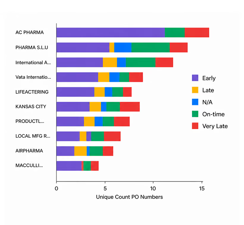

This is the compounding advantage. It has been running for {{years}} years. Every day it runs, the gap widens.
Every prediction. Every agent action. Every outcome. Grounded in the Graph.
Enterprise-grade security. Full chain of custody. Your data stays yours.



Carrier Capacity Signal

Sanctions Flag

Port Dwell Attribution
The Graph is live. So is the workforce that operates on it.